TEST YOUR SITE IN LYNX 2024-05-01 When was the last time you tested your website in a text-only browser like Lynx (or ELinks, or one of several others)? Perhaps you should. I'm a big fan of CSS Naked Day. I love the idea of JS Naked Day, although I missed it earlier this month (I was busy abroad, plus my aggressive caching, including in service workers, makes it hard to reliably make sweeping changes for short periods). I'm a big fan of the idea that, for the vast majority of websites, if it isn't at least usable without any CSS or JavaScript, it should probably be considered broken. This year, I thought I'd celebrate the events by testing DanQ.me in the most-limited browser I had to-hand: Lynx. Lynx has zero CSS or JavaScript support, along with limited-to-no support for heading levels, tables, images, etc. That may seem extreme, but it's a reasonable analogue for the level of functionality you might routinely expect to see in the toughest environments in which your site is accessed: slow 2G connections from old mobile hardware, people on the other side of highly-restrictive firewalls or overenthusiastic privacy and security software, and of course users of accessibility technologies. Here's what broke (and some other observations): S AT THE TOP I see the thinking that Lynx (and in an even more-extreme fashion, ELinks) have with showing "alternate versions" of a page at the top, but it's not terribly helpful: most of mine are designed to help robots, not humans! | |

| |
I wonder if switching from elements to Link: HTTP headers would indicate to Lynx that it shouldn't be putting these URLs in humans' faces, while still making them accessible to all the services that expect to find them? Doing so would require some changes to my caching logic, but might result in a cleaner, more human-readable HTML file as a side-effect. Possibly something worth investigating. Fortunately, I ensure that my s have a title attribute, which is respected by Lynx and ELinks and makes these scroll-past links slightly less-confusing. | |

| |
POST LIST INDENTATION

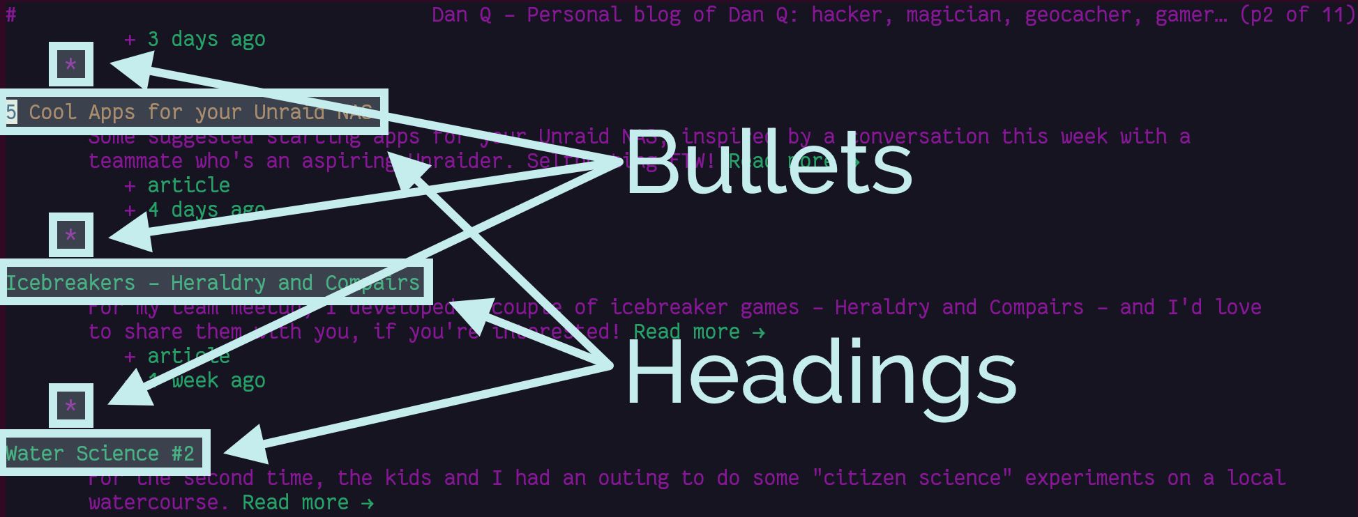
Posts on the homepage are structured a little like this:
Post Title...post metadata, image, and things... is not the best solution. Let's see how Lynx handles it: | |

| |
It's not intolerable, but it's a little ugly. CSS LIGHTBOXES ADD A STEP TO IMAGES I use a zero-JavaScript approach to image lightboxes: you can see it by clicking on any of the images in this post! It works by creating a (closed) | |

| |
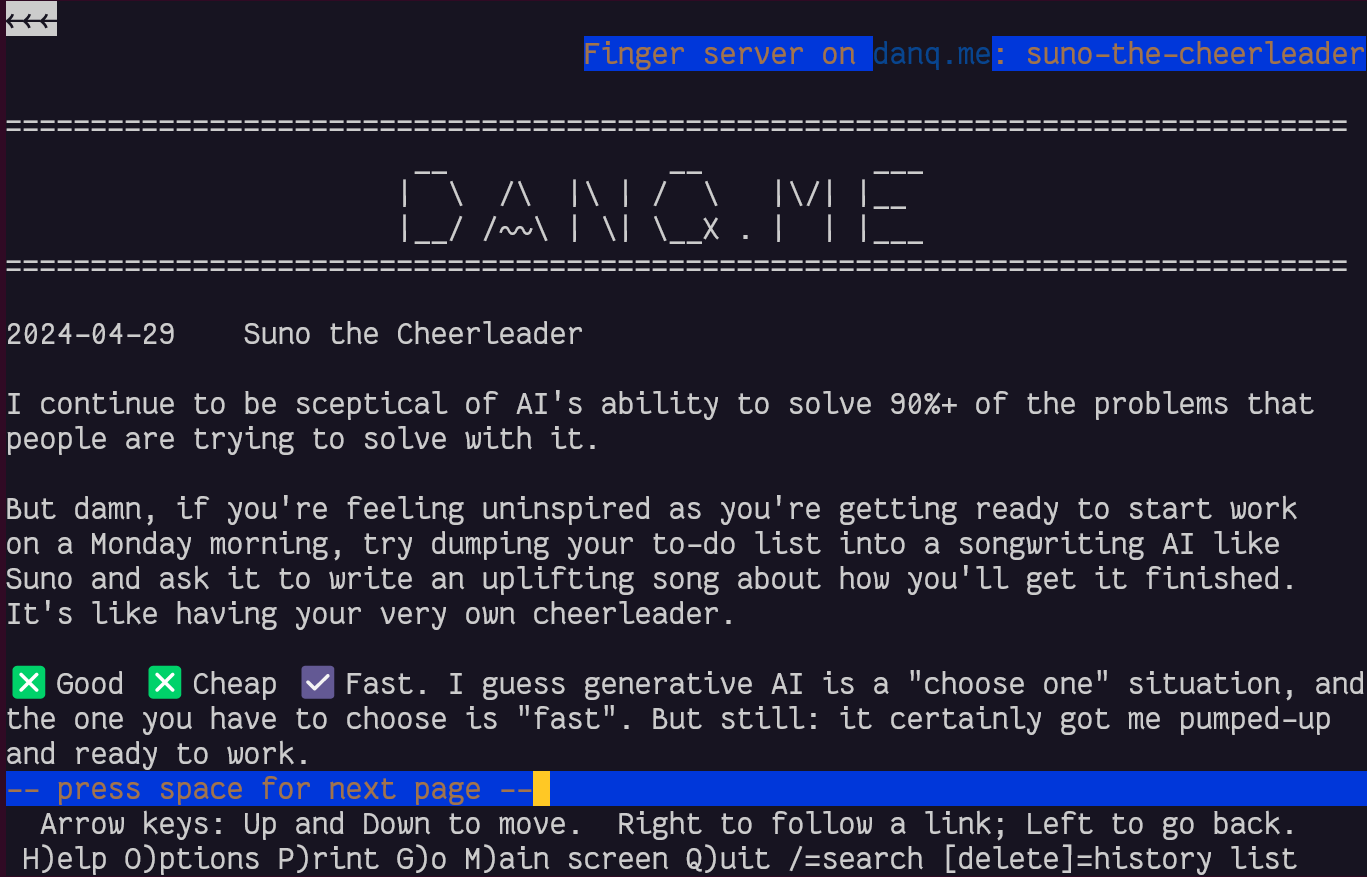
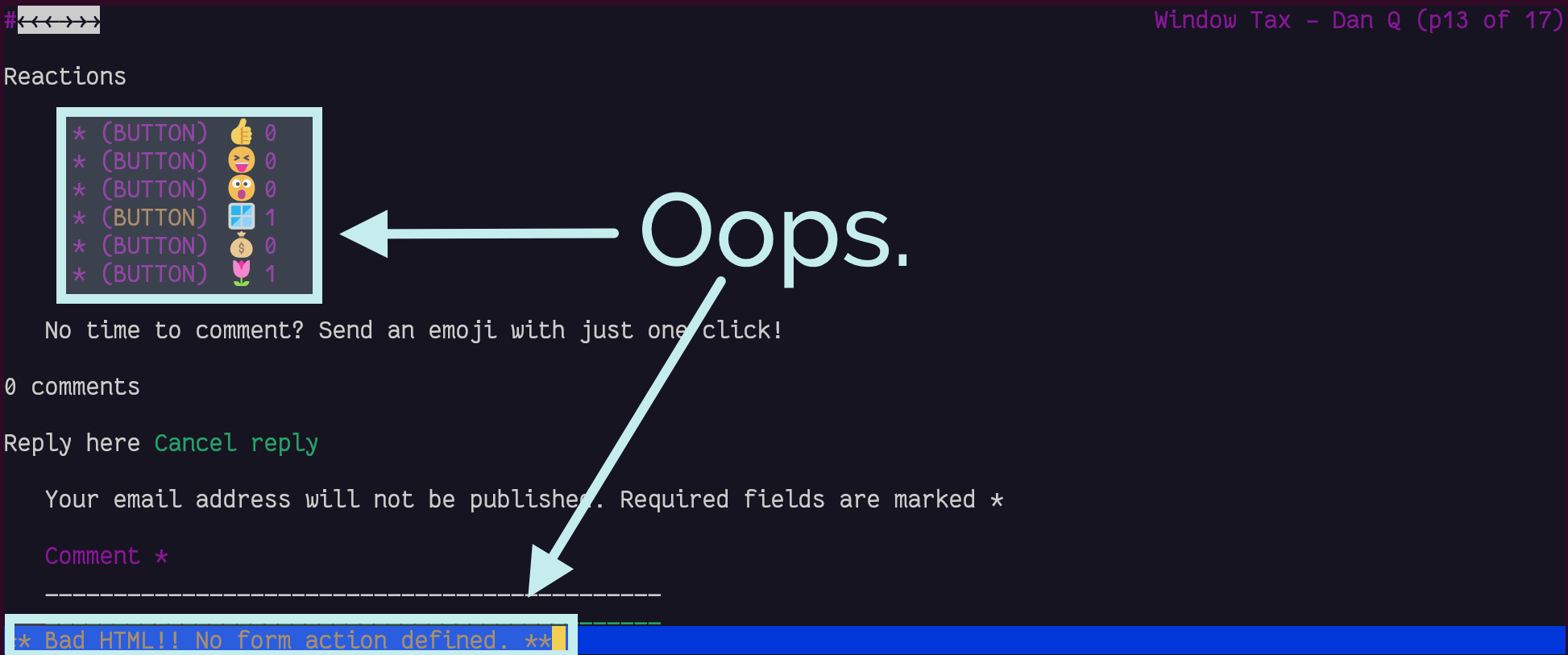
In a fun quirk and unusually for a standard of its age, the Finger specification did not state the character encoding that ought to be used. I guess the authors just assumed everybody reading it would use ASCII. But both my WordPress-to-Finger bridge and Lynx instead assume that UTF-8 is acceptable (being a superset of ASCII, that seems fair!) which means that emoji work (as shown in the screenshot above). That's nuts, isn't it? YOU CAN'T REACT TO ANYTHING Back in November I added the ability to "react" to a post by clicking an emoji, rather than typing out a full comment. Because I was feeling lazy, the feature was (and remains) experimental, and I didn't consider it essential functionality, I implemented it mostly in JavaScript. Without JavaScript, all you can do is see what others have clicked. In a browser with no JavaScript but with functional CSS, the buttons correctly appear disabled. But with neither technology available, as in Lynx, they look like they should work, but just... don't. Oops. | |

| |
If I decide to keep the reaction buttons long-term, I'll probably reimplement them so that they function using plain-old HTML and HTTP, using a | |
Lynx | |
ELinks | |
K.Mandla's blog post comparing six text-mode browsers | |
CSS Naked Day | |
JS Naked Day | |
OEmbed | |
Blog post describing my zero-JS approach to lightboxes | |
My blog post describing how I made DanQ.me accessible over the Finger protocol | |
Finger specification | |
My blog post about adding emoji reactions | |
Ruth | |
Akismet | |
Antispam Bee |